CODE Article Web Design System — Desktop & Mobile v1.0
Imported from Evernote: Article Web Design System — Desktop & Mobile v1.0. Source created October 28, 2026; last updated November 3, 2026 (Pacific/Honolulu). Imported November 3, 2026. The specification and its proposed values are preserved as written; this import does not establish the current application's implementation status.
Status: Proposed implementation specification, October 28, 2026. The broad visual direction was approved in the CODE Software Infrastructure design discussions; exact CSS values, breakpoints, component measurements and interaction details below are initial engineering proposals requiring real browser review, accessibility testing and design sign-off. This document is for the magazine-only codemag.com article experience, not a Microsoft Docs-like documentation UI.
1. Source of truth and design principles
Reference the Evernote notes New Article Design (contains six actual attached visual design references), Article Design Discussion - October 28th, 2026, Editorial Accent Color System, Author Portrait System, Diagram System, Data Visualization System and Image Classifier System in Magazine Content. Use the attached mockups as visual-direction references, NOT as exact dimensional specifications. Confirm exact CODE logo and approved author artwork from production assets.
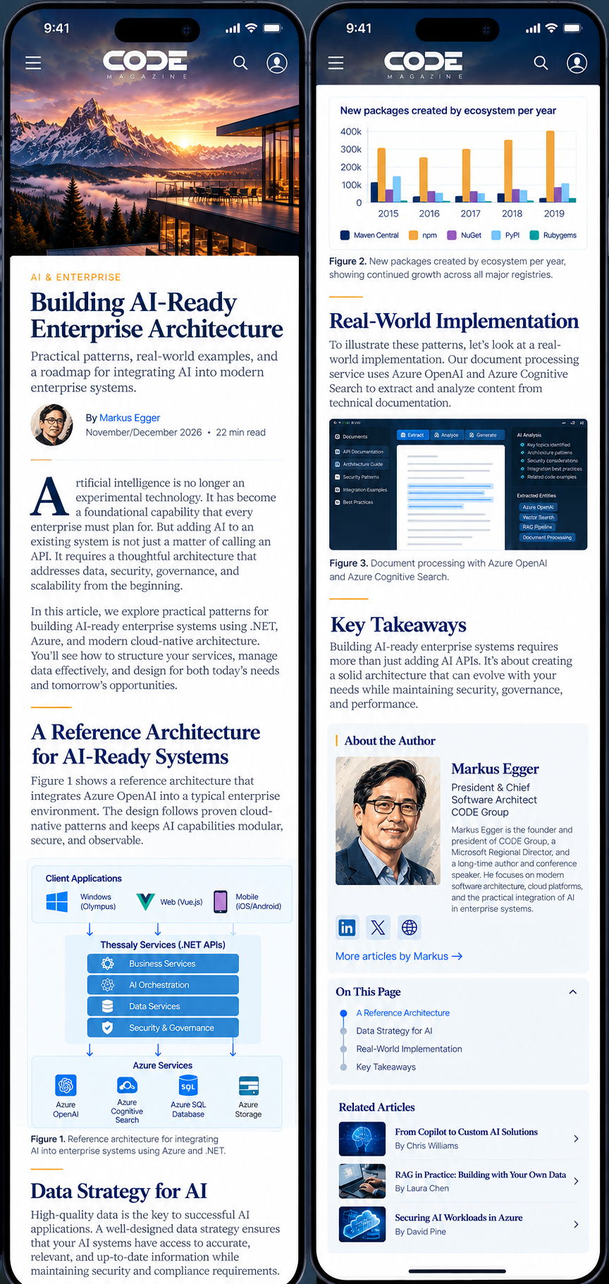
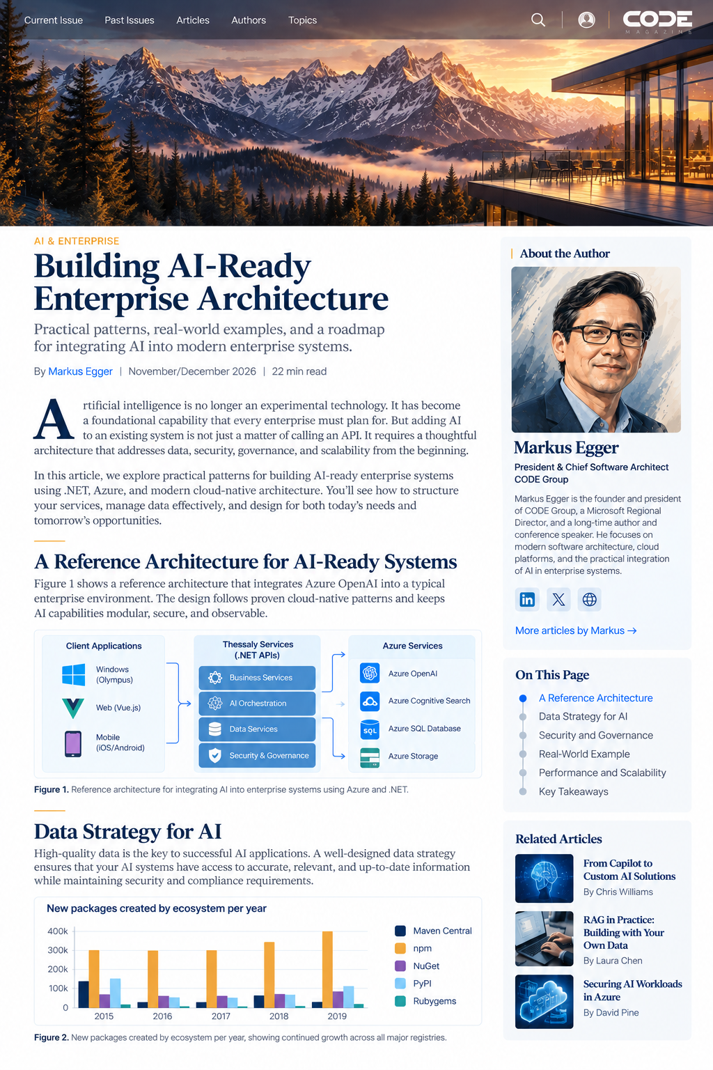
- Editorial, not documentation: cinematic full-width hero, elegant serif typography, ample whitespace, magazine hierarchy, no permanently exposed left documentation tree.
- Hero first: hero extends to top of page behind semi-transparent masthead. Headline, deck and author information follow BELOW the image. No headline over image by default.
- Magazine-only brand: CODE logo at far right of desktop header, search and My CODE icon immediately to its left; navigation left-aligned. Header should remain consistent with mobile and other CODE collateral.
- Prominent author: large rectangular CODE painterly portrait with compact bio in desktop right rail; mobile portrait/byline near opening with longer bio later. Never substitute a generic photo or cartoon.
- Technical fidelity: images, diagrams and charts are pre-approved by their specialized pipelines. Web layout must not modify their technical content, crop off data, or hide important captions.
- Shared visual language: navy headings and editorial serif, clean sans-serif metadata, two article-specific coordinated accent colors, restrained shadows, pale author-panel tint, and a light/dark/sepia reading experience.
2. Responsive layout policy
Use CSS Grid/Flexbox, fluid clamp() values and content-driven breakpoints. The breakpoints below are initial proposals, not fixed device classes. Do not hardcode layout to specific iPhone/iPad models.
| Viewport width | Layout behavior |
|---|---|
| Below 600px | Mobile: single article column; collapsed navigation; compact header; no persistent sidebar; full-width figures and responsive media; article margins 16–20px. |
| 600–899px | Large mobile/small tablet: single article column with wider outer margins and comfortable max reading width; optional inline author bio and table-of-contents disclosure. |
| 900–1199px | Tablet/compact desktop: single primary reading column; right rail collapses into inline modules or narrower secondary region only when enough width remains. No cramped two-column article body. |
| 1200–1599px | Desktop: primary article reading column + right editorial rail, separated by 40–56px gap; hero remains full viewport width. |
| 1600px and above | Wide desktop: same two-region composition with bounded content width; increase outer whitespace rather than endlessly expanding article line length. |
Suggested layout tokens: page max-width 1360px; primary article measure 700–760px (reader-adjustable), right rail 280–320px, grid gap 48px, outside padding clamp(20px, 4vw, 64px). Use minmax(0,1fr) to prevent long code/tables from blowing out the grid. At smaller widths place author/related modules inline after suitable editorial boundaries.
3. Hero and header
- Hero image full-bleed horizontally, aligned to top viewport edge, object-fit:cover with an author/editor-selected focal point (object-position). Preserve safe subject area for desktop/mobile crop variants; do not force the same crop when composition fails.
- Proposed hero height: desktop clamp(420px, 48vw, 680px); tablet clamp(320px, 48vw, 500px); mobile clamp(240px, 65vw, 420px). The exact heights are proposals to validate against article imagery and page proportions.
- Header positioned over hero, semi-transparent deep navy/neutral with backdrop blur as supported; approximate height 76px desktop, 64px tablet, 56–64px mobile. Maintain legibility against bright/dark hero art with adaptive overlay or stable protective backing.
- Desktop order: left navigation links; right search icon, user/My CODE icon, far-right CODE masthead/logo. On mobile, compact menu/search/account controls and CODE logo; confirm precise visual order against approved mobile reference.
- At scroll, transition to a compact sticky header with opaque enough background for legibility; avoid large layout shifts. Respect reduced-motion preferences.
- Search control remains a real, accessible action; detailed search overlay/results UI is a separate future design decision. Do not implement a decorative nonfunctional search icon.
4. Typography and editorial hierarchy
Font selections below are provisional: Prefer a premium editorial serif such as Source Serif 4 (or another approved licensed serif) for article title, headings and body; Segoe UI Variable / Inter-like clean sans-serif for navigation, bylines, metadata, captions, controls and author panels; a legible monospaced font such as Cascadia Code for code. Test licensing, variable-font availability, Latin/non-Latin coverage and print/web consistency before finalizing. Use robust fallbacks and avoid layout shifts.
| Element | Proposed desktop | Proposed mobile |
|---|---|---|
| Article H1 | clamp(2.8rem,4vw,4.25rem), weight 650, line-height 1.08, letter-spacing -0.025em | clamp(2.1rem,7vw,2.8rem), line-height 1.12 |
| Deck / standfirst | 1.25rem, line-height 1.5 | 1.1rem, line-height 1.5 |
| Article body | 1.125rem (18px), line-height 1.68 | 1.0625rem (17px), line-height 1.65 |
| H2 | 2rem, line-height 1.2, weight 650 | 1.65rem, line-height 1.25 |
| H3 | 1.45rem, line-height 1.3, weight 650 | 1.3rem, line-height 1.32 |
| H4 | 1.15rem, line-height 1.35, weight 700 | 1.1rem, line-height 1.35 |
| Byline / metadata | 0.875–1rem, sans-serif | 0.875rem, sans-serif |
| Figure captions | 0.875rem, line-height 1.5, sans-serif | 0.8125–0.875rem |
| Code | 0.875rem, line-height 1.5, monospace | 0.8125–0.875rem, scroll if necessary |
Body paragraphs: margin-block-end about 1.2em; H2 margin-block-start about 2.2em and end 0.65em; H3 margin-block-start 1.6em and end 0.5em. Keep headings with following paragraphs; avoid widowed headings and orphaned captions. Use readable text measure around 65–78 characters per line (default about 72ch); reader width preference may change it within safe limits.
5. Color tokens and article accents
Use consistent deep navy for major headings, dark neutral body text, restrained blue links and white/neutral surfaces. Article-specific primary/secondary accent colors are generated and validated by the Editorial Accent Color System, not chosen arbitrarily in CSS. Provisional tokens: navy #102747, body #253445, muted #627286, link #2875B9, light surface #FFFFFF, light-muted #F5F7F9, border #DFE5EC. These are engineering starting points, not final approved palette.
- Primary accent for Quick ID, short section rules, drop caps, subtle pull quote border and selected metadata. Secondary accent for complementary details and event/marketing applications, not random alternating heading colors.
- Author panels use very pale tint of the article primary accent with navy text. Never use full-saturation colored author cards by default.
- Light, dark and sepia modes must be token-based. In dark mode use dark navy/charcoal surfaces and appropriately brightened text/links; in sepia use warm off-white article canvas and dark warm text. Preserve brand accent intent while checking contrast.
- WCAG AA target: 4.5:1 normal text, 3:1 large text and meaningful UI indicators. Check real color combinations and focus states computationally.
6. Article opening and author modules
- Under hero: article category/Quick ID/date/reading time, prominent H1, deck, author byline and relevant actions. Keep text outside hero image. A short accent rule may link hero palette to article content.
- Desktop right rail: prominent rectangular painterly portrait (proposed 280–320px wide, 4:5 or similarly approved crop), author name, credentials, short 40–70-word bio, optional links. Pale accent-tinted panel; no tiny circular portrait as the main identity treatment.
- On mobile: compact byline/portrait near title, with longer bio later in article or after body; avoid a huge bio before readers reach the opening paragraph. Portrait remains in the approved painterly style.
- Right rail may also contain restrained table of contents, reading tools or related stories; it should never look like a documentation navigation pane. TOC can be sticky within sensible boundaries on desktop, but must not cover footer or author content.
- Use actual author assets approved through the Image Classifier and Author Portrait System; preserve likeness, crop safety and image alt text.
7. Article content components
- Figures: images max-width:100%, height:auto, no accidental clipping; preserve entire diagram/chart content, legends and labels. Use figure/figcaption with bold “Figure N” and descriptive caption; allow lightbox/zoom on mobile when labels are dense. Use original aspect ratio unless an approved alternate crop exists.
- Screenshots: preserve actual pixels/UI; do not apply visual filters that change the depicted software. Support zoom, full-size viewing and print-friendly caption/source.
- Code listings: monospace, syntax highlighting with accessible light/dark palettes, horizontal scrolling for long unbreakable lines, optional copy control and listing number/title. Avoid soft wrapping that silently changes code semantics. Desktop wide blocks may span article measure; mobile uses overflow-x:auto and optional expand/full-screen reading.
- Tables: real semantic HTML tables, responsive horizontal scrolling, sticky first column only when useful, clear headers, restrained row rules and caption/source. Do not squeeze columns until unreadable.
- Pull quotes: navy serif or editorial type, very pale article-accent background or none, narrow primary-accent vertical rule, no oversized decorative quote marks. Keep content verbatim from article.
- Blockquotes, lists and callouts: share spacing and typography tokens; avoid brightly colored summary boxes. Link and focus styles remain distinct and accessible.
- Links: blue/approved link token with underline or unmistakable affordance in body text; external links and citations have clear behavior. Preserve figure/listing anchors for deep linking.
- Article navigation: previous/next, related articles, author bio and issue context after article; avoid interrupting core reading flow with heavy cards or ads.
8. Reader preferences and persistence
- Provide an accessible “Aa” reading-settings control near article metadata and optionally in compact sticky header. Proposed options: font size, line height, reading width, serif/sans body font, alignment, light/dark/sepia reading theme.
- Proposed font scale presets: 0.9, 1.0, 1.1, 1.2, 1.35; line-height presets: compact 1.5, standard 1.68, relaxed 1.85. Reader width presets: narrow 60ch, standard 72ch, wide 84ch. Validate for real content and avoid overriding browser zoom/accessibility.
- On mobile, width preference adjusts page gutters within safe bounds rather than creating an unusable narrow column. Hide or constrain options that do not meaningfully apply at current width.
- Use client persistence for guests and account-synced preferences when signed in, with a clear reset-to-default action. Do not claim server synchronization until implemented.
- Dark mode may be site-wide; sepia may be article-specific. Honor prefers-color-scheme when no explicit choice exists and prefers-reduced-motion for transitions.
9. Responsive interactions and accessibility
- Minimum comfortable touch target about 44px on mobile; visible keyboard focus, logical tab order, correct landmark/heading hierarchy, accessible menu/search/dialog controls.
- Use viewport-aware image loading: hero priority, lower figures lazy-loaded, srcset/sizes and modern formats where appropriate; retain full-quality originals for zoom and print.
- Respect zoom up to 200% and narrow viewports without horizontal page overflow (except intentionally scrollable code/tables). Use fluid type with reasonable limits.
- Provide meaningful alt text for informative illustrations and author portraits, and empty alt for purely decorative elements. Captions do not automatically substitute for accessible descriptions of complex charts.
- Header overlay must remain readable over any hero, including high-key snow, bright sky or very dark imagery. Test blur fallbacks and high-contrast mode.
- Use semantic HTML article/main/nav/aside/figure elements and avoid using visual order that contradicts DOM reading order.
10. Starter CSS design tokens and media queries
This is an implementation starting point, not final tested CSS. Integrate with the site's existing component architecture and CSS naming conventions. Some selectors (e.g., display:contents for rail) require accessibility/DOM-order testing; production implementation may use explicit grid areas instead.
/* CODE Article Web Design System v1.0 — PROPOSED tokens, not final */
:root {
  --code-navy: #102747;
  --code-text: #253445;
  --code-muted: #627286;
  --code-link: #2875B9;
  --code-surface: #FFFFFF;
  --code-surface-muted: #F5F7F9;
  --code-border: #DFE5EC;
  --article-accent-primary: #C58A37; /* populated from approved article palette */
  --article-accent-secondary: #2875B9;
  --article-accent-tint: #F9F4EA; /* computed/approved, not guessed */
  --font-editorial: "Source Serif 4", Georgia, serif;
  --font-ui: "Segoe UI Variable", "Segoe UI", Arial, sans-serif;
  --font-code: "Cascadia Code", Consolas, monospace;
  --article-measure: 72ch;
  --article-font-size: 1.125rem;
  --article-line-height: 1.68;
  --page-max: 1360px;
  --page-gutter: clamp(20px, 4vw, 64px);
  --rail-width: 300px;
  --content-gap: 48px;
}
[data-reading-theme="dark"] {
  --code-surface: #101B29;
  --code-surface-muted: #192638;
  --code-text: #E7ECF2;
  --code-muted: #B1BECC;
  --code-border: #34465B;
  --code-link: #78B9F0;
}
[data-reading-theme="sepia"] {
  --code-surface: #F7F0E3;
  --code-surface-muted: #EEE5D5;
  --code-text: #3E352D;
  --code-muted: #6C6258;
}
.article-page { color: var(--code-text); background: var(--code-surface); }
.article-hero { width: 100%; height: clamp(420px, 48vw, 680px); object-fit: cover; }
.site-header--overlay {
  position: absolute; inset: 0 0 auto;
  min-height: 76px;
  background: rgb(10 25 45 / 58%);
  backdrop-filter: blur(16px);
}
.article-shell {
  max-width: var(--page-max);
  margin-inline: auto;
  padding-inline: var(--page-gutter);
  display: grid;
  grid-template-columns: minmax(0, 1fr) var(--rail-width);
  gap: var(--content-gap);
}
.article-body {
  min-width: 0;
  max-width: var(--article-measure);
  font-family: var(--font-editorial);
  font-size: var(--article-font-size);
  line-height: var(--article-line-height);
}
.article-title {
  font-family: var(--font-editorial);
  font-size: clamp(2.8rem, 4vw, 4.25rem);
  line-height: 1.08;
  letter-spacing: -0.025em;
  color: var(--code-navy);
}
.article-body figure img { display: block; max-width: 100%; height: auto; }
.article-body pre, .article-body .table-scroll { overflow-x: auto; max-width: 100%; }
.article-author-panel { background: var(--article-accent-tint); }
@media (max-width: 1199px) {
  .article-shell { grid-template-columns: minmax(0, 1fr); }
  .article-rail { display: contents; } /* place children explicitly in DOM/order */
  .article-hero { height: clamp(320px, 48vw, 500px); }
}
@media (max-width: 599px) {
  :root { --page-gutter: 18px; --article-font-size: 1.0625rem; }
  .site-header--overlay { min-height: 60px; }
  .article-hero { height: clamp(240px, 65vw, 420px); }
  .article-title { font-size: clamp(2.1rem, 7vw, 2.8rem); line-height: 1.12; }
  .article-body { line-height: 1.65; }
}
@media (prefers-reduced-motion: reduce) {
  *, *::before, *::after { scroll-behavior: auto !important; transition-duration: 0.01ms !important; }
}
11. Implementation notes for CODE's web stack
- Target the existing ASP.NET MVC public website architecture (.NET 10 or current CODE production runtime). Use semantic server-rendered article HTML where possible; Vue components may be used selectively for search, reader preferences, navigation and image zoom. Do not require a complete front-end rewrite solely for styling.
- Keep article content and metadata separate from CSS presentation: hero image and focal point, primary/secondary accents, author master portrait, byline, section headings, figure/listing metadata, and article type. Use existing CODE APIs/Thessaly services and SQL Azure storage conventions.
- Prefer a shared design-token source for web/print where practical, but allow print-specific typography and CMYK conversions. Article web content may contain rich technical Markdown/HTML; sanitize untrusted content and preserve code formatting.
- Load fonts efficiently with appropriate font-display behavior and subsets; test long articles and complex figures for cumulative layout shift, mobile performance and print-to-web consistency.
12. Acceptance tests and design QA
- Test viewport widths at 320, 375, 430, 600, 768, 900, 1024, 1200, 1440, 1920 and 2560 CSS pixels, plus browser zoom and landscape mobile. These are QA checkpoints, not necessarily media-query boundaries.
- Test desktop and mobile with bright and dark hero images; verify translucent header readability, hero crop/focal point, no overlaid headline and correct logo/search/account positions.
- Test articles with short/long titles, multiple authors, no bio, very long biographies, many headings/TOC entries, huge code listings, wide tables, screenshots, diagrams, charts and caption-heavy content.
- Verify reading settings persist and do not break responsive layout; check dark/sepia contrast, keyboard/screen reader access, focus, reduced motion, text zoom and narrow screen overflow.
- Compare live browser screenshots with the approved Evernote New Article Design reference images and the conversation's accepted desktop/mobile visual direction. Have an editorial/design review before freezing exact CSS values.
- Performance targets to be set and measured with actual deployment; do not assert fixed Lighthouse/Core Web Vitals scores without testing.
13. Open decisions before final sign-off
- Confirm final licensed font families and whether print and web should use the same exact serif/sans families.
- Confirm exact desktop header height, sticky behavior, scroll transition and mobile menu/search layout.
- Finalize desktop author rail width, position relative to headline, author bio length, and mobile bio placement.
- Finalize search overlay/results experience and user/My CODE destination.
- Finalize Aa reading-preference control placement, options, defaults, persistence and dark/sepia site scope.
- Confirm approved color palette version, light/dark article accent variants and figure caption typography.
- Decide whether opinion columns without print hero still receive a generated hero on web; maintain the shared portrait style.
Summary: The visual direction is approved; these proposed tokens and breakpoints make it actionable for developers. The next milestone is a working responsive browser implementation with side-by-side editorial review, not further unverified image mockups.
Reference Images
Desktop article page (web):
Mobile article page: